
I’m a huge fan of the design of Reeder, and wanted to take a stab at recreating their fading two-tone horizontal rule in CSS for this blog.
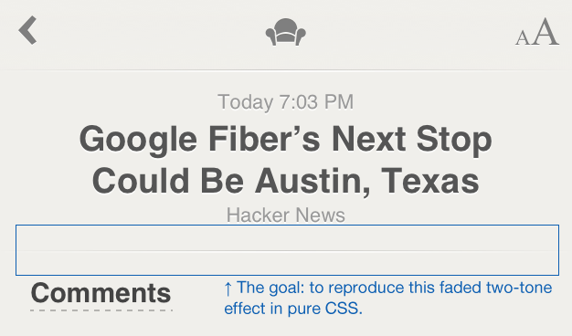
Here’s what the original looks like:
Zooming in reveals that this is actually made up of two separate lines - a 1px-high grey line, with a 2px-high white line below it:

For the purposes of this article, I’ll be using a page background color of #f7f6f4, and using #c3c3c3 for the main HR color.
The obvious way to do this in pure CSS was to use an ::after pseudo-element, though this proved to be easier said than done.
Initially I tried a 1px-high dark HR element, followed by a 2px-high white ::after pseudo-element:
hr {
  height: 1px;
  border: 0;
  background-color: #c3c3c3;
}
hr::after {
  content: '';
  display: block;
  height: 2px;
  background-color: #fff;
}
The problem with this soon became clear - the ::after element completely covers the HR. I’ve limited the white ::after element to %50 width here and zoomed in to demonstrate the problem:

After a lot of false starts and stumbles trying to push the ::after element around with margins and various positioning hacks, I realised I was going about the whole thing backwards.
If the ::after element insists on covering the HR element, we need to swap the colors, and make the HR element 3px tall with a white background, and turn our ::after element into the main HR line:
hr {
  height: 3px;
  border: 0;
  background-color: #fff;
}
hr::after {
  content: '';
  display: block;
  height: 1px;
  background-color: #c3c3c3;
}
Getting closer! Here’s the above zoomed in:

Now we need to apply the fade effect. I’ve skipped the various browser prefixes for the time being to keep things simple:
hr {
  height: 3px;
  border: 0;
  background-color: #fff;
  background-image: linear-gradient(left, #f7f6f4, #fff, #f7f6f4);
}
hr::after {
  content: '';
  display: block;
  height: 1px;
  background-color: #c3c3c3;
  background-image: linear-gradient(left, #f7f6f4, #c3c3c3, #f7f6f4);
}
The key to this is the use of linear-gradient background images. The main HR element (remember this is our slightly taller, white background) fades horizontally from the page background color, to white, and back to the page background color. The ::after element (our main 1px-high grey line) does the same, but fades to our chosen #c3c3c3 rather than white.
Mission accomplished!

With the appropriate browser prefixes, this works in IE10 and all other modern browsers.
There’s one final problem - browsers that don’t support linear gradient backgrounds will get a 3px-high white line, due to the background-color: #fff. It turns out that we can actually set the background-color to whatever we want for legacy browsers, as the newer browsers will over-ride it with the background-image, so we can swap out our white background-color for #c3c3c3.
Here’s the finished product, including browser prefixes:
body {
  background-color: #f7f6f4;
}
hr {
  height: 3px;
  border: 0;
  background-color: #c3c3c3;
  background-image: -webkit-gradient(linear, 0 0, 100% 0, from(#f7f6f4), to(#f7f6f4), color-stop(50%, #fff));
  background-image: -webkit-linear-gradient(left, #f7f6f4, #fff, #f7f6f4);
  background-image: -moz-linear-gradient(left, #f7f6f4, #fff, #f7f6f4);
  background-image: -ms-linear-gradient(left, #f7f6f4, #fff, #f7f6f4);
  background-image: -o-linear-gradient(left, #f7f6f4, #fff, #f7f6f4);
}
hr::after {
  content: '';
  display: block;
  height: 1px;
  background-color: #f7f6f4;
  background-image: -webkit-gradient(linear, 0 0, 100% 0, from(#f7f6f4), to(#f7f6f4), color-stop(50%, #c3c3c3));
  background-image: -webkit-linear-gradient(left, #f7f6f4, #c3c3c3, #f7f6f4);
  background-image: -moz-linear-gradient(left, #f7f6f4, #c3c3c3, #f7f6f4);
  background-image: -ms-linear-gradient(left, #f7f6f4, #c3c3c3, #f7f6f4);
  background-image: -o-linear-gradient(left, #f7f6f4, #c3c3c3, #f7f6f4);
}
… and here’s the original Reeder horizontal rule (top), compared to our pure-CSS equivalent (bottom):

You can see the HTML version in action on the home page of this site.